Mobile App for Alignment Healthcare
The Project
Create a solution that would enable members to easily access tools and account information while navigating through their healthcare journey.
Role: Producer and UX Designer
Budget: ~$105k
Constraints: Budget (T&M), HIPPA, Integration, Resource Availability
Approach
Insights
Stakeholder interviews provided key insights.
Users were over 65 or younger with a disability. App accessibility was key.
Access to claims, benefits and ID Card information was a priority.
Feature Prioritization
Prioritizing features helped us determine critical for launch.
We collaborated with the client on what members needed and compared that to what data was available to determine the most valuable features for MVP.
IA
With data protection and adhering to HIPPA a high priority we mapped the technical ecosystem to understand what data was available.
Combining this with our MVP feature list we were able to create the app structure.
UX
I designed low fidelity, high fidelity wireframes and a prototype.
During this process shifting priorities and technical obstacles created some changes to the MVP functionality.
UI
I worked with a designer to translate the experience into a UI design.
High amount of collaboration between the design team and client while solidified functional requirements into UI.
Implementation
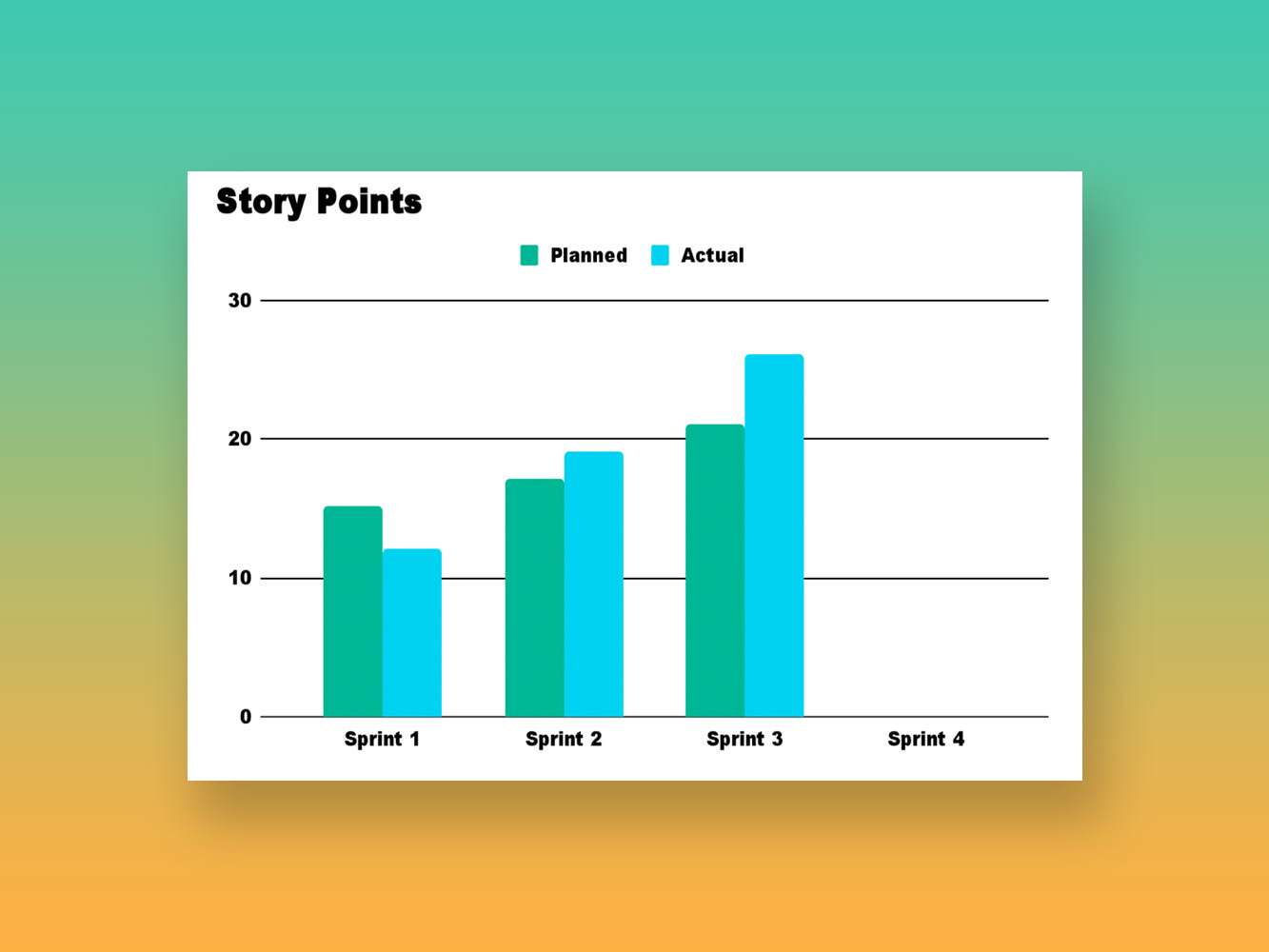
Aligned implementation teams on a sprint cadence and functional requirements.
Adapting the schedule to align with shifting teams on the client side.
Results
We worked really hard to adapt to shifting scope and stay within a timeline/budget.
A mobile application was released for both iOS and Android devices, giving members the ability to access their healthcare information in an accessible, easy and convenient way.


